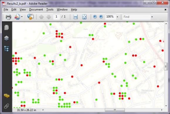
Questionnaires are a cost-effective way of collecting data from customers or members of the public. To understand the results, we often start by summarising responses in the form of tables, summary statistics, graphs and charts. Many questionnaires, however, may benefit from spatial analysis. Mapping survey results in this way can highlight important geographical trends that might not be apparent from the raw data.
Take the following examples:
- A tourism company would like to analyse customer satisfaction.
- An action group would like to interpret and present results relating to a major planning application.
- An event organiser would like to change their marketing approach for their next event based on an online survey of previous attendees.
In all these cases, it is obvious that analysing and presenting the data spatially could highlight a specific geographic tendency or support a particular argument. To do this effectively, it is best to use a GIS (Geographical Information System) or employ the services of a GIS or mapping specialist such as Lovell Johns.
In order to spatially interpret your data, it is essential that a mandatory question is included in your survey that reliably and consistently gives a location sufficient for your needs. Respondents are unlikely to want to give a full address, especially to commercial companies, and this level of spatial accuracy is probably not required.
Asking a respondent for their postcode is far more likely to get a response. Mapping survey results by postcode can give an accuracy of each respondent down to a few hundred meters or less and your location responses will be consistent. Alternatively, you can analyse results by postcode sector (e.g. OX29 8), or postcode district (e.g. OX29) which can be derived from the full postcode.
If your questionnaire is regional or national, you may be tempted to ask for a respondent’s town, city, local authority or county. The disadvantage of this is that your results may not be consistent or accurate. For instance, there is often confusion between traditional counties and the modern-day mixture of counties and unitary authorities. One person may say they live in Gloucestershire, while someone else in the same location may say they live in South Gloucestershire. Similarly, if you ask a respondent for their town or city, a person in a rural area may give the name of their village, nearest town or nearest city. If you have a respondent’s postcode, then it is possible to consistently allocate responses to administrative or statistical areas using GIS.
Approaches to Mapping Survey Results
Survey results can be mapped using different approaches, depending on the question asked.
Binary responses, such as Yes or No can simply be mapped by using red and green points. Using GIS, it is possible to spatially offset any points that represent the same postcode.
For more regional or national extents, you could summarize responses by postcode sectors or administrative areas, based on the overall tendency. This approach was often seen after the recent Scottish independence referendum, highlighting those areas such as Glasgow and Dundee that said ‘Yes’ to independence despite the overall result.
Scale ratings, such as a range from 1-5, are often used to gauge how satisfied a customer is about a service or product. For point values such as postcodes, this could simply be shown by using a range of colours such as a colour ramp that ranges from green, to orange, to red. Alternatively, the colour of the point could remain consistent, and the size of the point could change.
A respondent may be asked to choose an answer from choice of options, such as ‘Which of these brands are you most familiar with?’ More sophisticated GIS software will allow you to automatically create a small pie chart or bar chart for each individual point or area on a map.
Reviewing and Presenting Maps
If you are using GIS or a mapping specialist, then you may want to spatially analyse results yourself, before deciding on which results to present or publish. Some GIS software will allow the export of layered PDF files, enabling you to turn on and off results from different questions.
When it comes to presenting your maps, you can of course export maps from GIS to image formats such as JPEG and insert your maps into applications such as Microsoft PowerPoint.
Further Analysis
GIS allows you to map survey results and spot trends that might not be obvious using statistics alone. It can also help you to present any findings. Furthermore, GIS opens up a powerful new range of possibilities to further interpret your data, such as comparing your results to social grade or deprivation data.


Comments are closed here.