As we all work from home in these unsettled times, a major source of information is coming from online maps. This is either to show the spread of Covid-19 or the various statistics associated with it. In such a fast-moving environment, maps are a clear way to show how a pandemic moves and affects daily life.
As map makers and GIS consultants, we have been looking at some versions of these maps currently available (Please note that screenshots were taken over a period of a few days and will not reflect current statistics). We thought we’d share some thoughts about each of them below.
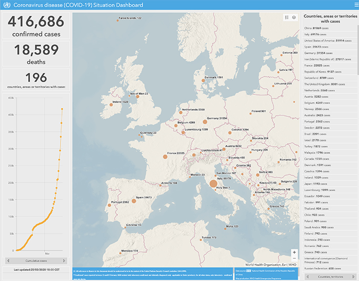
World Health Organisation (WHO) Interactive Map
The World Health Organisation (WHO) has an interactive map, based on Google Maps, which shows the number of cases in any country, with proportionately-sized circles for a quick visual reference. The user can zoom into a particular area for a more detailed view. Any point can be clicked to show more detail, including the date of the latest report.
The map also has a set of graphs to show the number of cases by date and the cumulative number over time. The map is clear and concise, although as with all the maps, cases are centred within the region, rather than on centres of population which may give an inaccurate visual presentation.
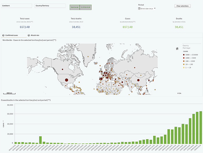
European Centre for Disease Prevention and Control (ECDC) map
The European Centre for Disease Prevention and Control (ECDC) map is a relatively simple interactive map, again with numbers of cases per country. Despite zoom functionality, the data does not change, and there is no increase in detail. The interesting feature of this digital map is that the user can place a lasso around a group of countries, and the interactive graphs change to show data for that region only.
The user can select to view statistics by a date range, or by country/continent. A second map shows cases reported in each country by period, as well as graphs and pie charts. On the whole, a useful quick reference at country level.
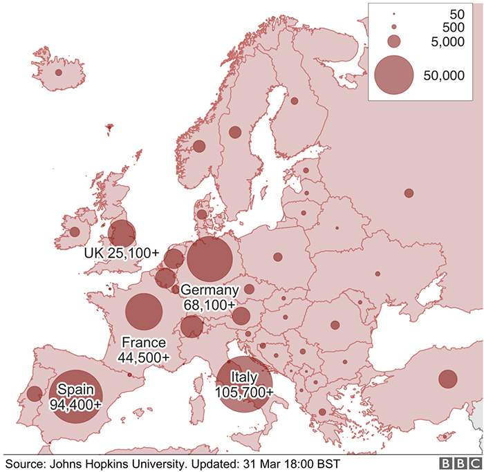
BBC Coronavirus in Europe Map
The BBC has become a vital source of information in the UK, with frequent updates and a host of useful information. Their map of Europe is quite basic, with no interactivity, but it does clearly show, with proportional circles, the number of cases of Covid-19 per country. As it is only a continental map, there could have been more granularity of information, but this is a useful quick guide.
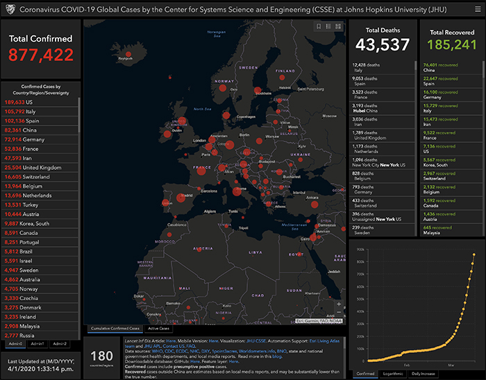
Detailed Covid-19 Map by Johns Hopkins University
The Center for Systems Science and Engineering (CSSE) at Johns Hopkins University have created a detailed Covid-19 map in ArcGIS Online. It uses a dark themed map base with red proportional circles to highlight the data portrayed. This was one of the first interactive maps to have been set up in the early days of the pandemic monitoring.
We noticed this in the Lovell Johns office at the end of January, when the global number of cases was just over 7,000. The map contains a lot of data on one page and is easy to navigate and clearly shows the information on display.
Public Health England Map of the UK
Public Health England have a map of the UK showing figures for England, Scotland, Wales and Northern Ireland. This interactive map can be zoomed into, to Local Authority and NHS Region level. The map can be clicked to show the number of cases of Covid-19 per Local Authority.
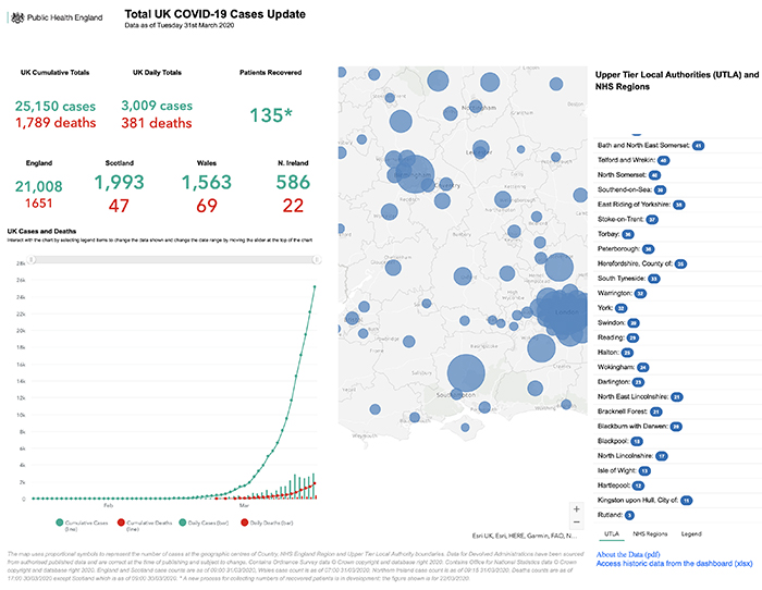
As would be expected, this map has more information on data from the United Kingdom and provides a detailed view on the current situation.
These five examples of maps give an idea of the wealth of current data available about Covid 19. This helps visualise the spread of a pandemic and to give a global picture of the current status. If you have spotted any other printed or digital mapping for coronavirus that is interesting or insightful in design or data, we would certainly like to hear about it.
Comments are closed here.