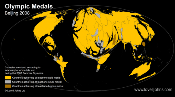
If a Country’s size was represented by the amount of Olympic medals won at the 2008 Beijing Olympics then the world map may look something like the image above.
Noticeable Countries which have grown due to their medal tally are Great Britain with an impressive 19 gold medals, South Korea (13 gold medals) and Japan (9 gold medals). Countries that appear to have shrunk in relation to podium places are Canada and Brazil.
The Olympic Cartogram was created by the Lovell Johns mapping experts using 2008 Olympic Medal Table Data to quickly and easily convey the achievements by participating countries during the 2008 Summer Olympics.
It uses the Gastner-Newman algorithm to resize country areas by a specific value, in this case the total number of medals won during the Games. The algorithm, developed in 2004, is based on a fundamental physics formula usually used to analyse the diffusion of gases. Although the countries are distorted in area, the layout and shapes of the countries are still recognisable.
As host nation this summer, Great Britain will want to better their performances from Beijing.


Comments are closed here.