Why domestic fuel prices differ depending on where you live!
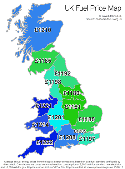
Ever wondered if domestic fuel bill prices would change if you moved house? Well as our UK fuel price map shows, depending on where you live in the UK, your energy bills could go up or down.
As Scottish Power becomes the latest of the big six energy companies to raise energy tariffs this autumn, we look at the regional variations in what we pay for domestic energy.
Our UK fuel price map shows mapping data average annual tariff prices from the “big six” by Distribution Network Operator (DNO) region. Prices are based on the average dual fuel standard tariffs paid by direct debit, with a medium consumption.
The UK fuel price map shows the difference that the transportation of gas makes to regional pricing, with those customers further from the distribution points paying more for their energy. The biggest difference in average prices is between South West England and Yorkshire, with a difference of over 3%. So the closer you live to a distribution point, the lower the cost is.
The companies say that transportation costs, accounting for about 14% of the average bill, differ across the UK.


Comments are closed here.